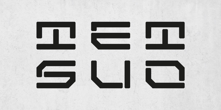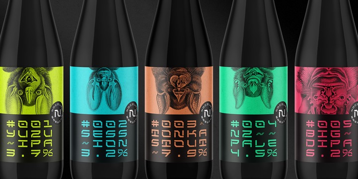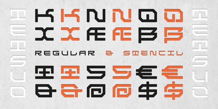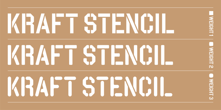
Kraft Stencil is a bold, display typeface that takes a new approach to vintage crate stencils. Utilizing octagon shapes as the backbone, the aim was to develop modernized stencil fonts. The font family comes in three weights, and each style consists of the different edge finishes of the character sets.
Monday, April 12, 2021
[wyofnxkyts] Download Kraft Stencil Fonts Family From Dan Choi
Wednesday, March 25, 2020
Download Hex Braille Fonts Family From Echopraxium
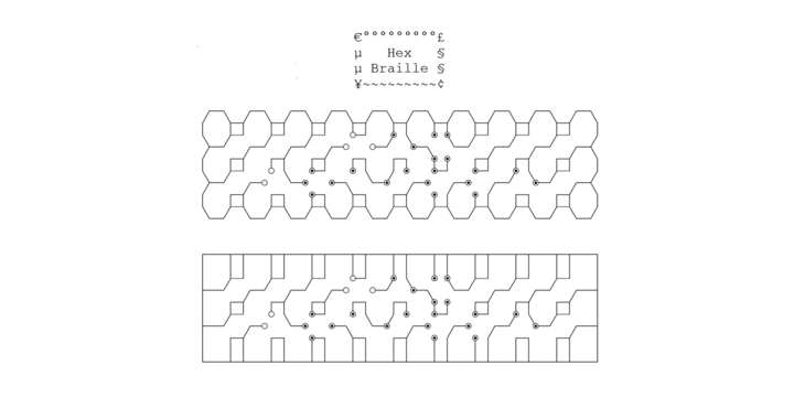
This monospace font is to display braille in an original although in a rather "steganographic" way.
Its glyphs are designed from a flat hexagon which can be read as 3 rows of 2 vertices (i.e. regular braille glyph grid). The initial design is illustrated by glyph 'ç' (no dot) and 'û' (6 dots) as illustrated by poster 5.
HexBraille glyphs are connected to each other, so there are 6 connections for each (2 on left/right and 4 on top/bottom). A text using this font will display a lattice, not the honeycomb but instead it will show various patterns and the whole looks similar to a PCB.
In the interline squares are frequent and diagonally there are unclosed "irregular convex octagons". For esthetical reasons, squares were favored over octagons.
Note 1: It's also possible to frame the text with 2 sets of border glyphs: octagonal (€°£Âµ§¥~¢) and rectangular (èéêïîà âä), as illustrated by poster 2.
Note 2: For best esthetical result (especially when using frame glyphs) with Microsoft Word, use CTRL+8 to display Pilcrow (¶) and Non Breaking Space glyphs.