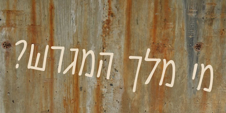
Rough pen graffiti with a childish look and feel.
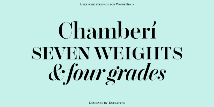 |
Chamberí is designed to be Vogue España's bestpoke typeface. An ambitious typographic branding project made for one of the most iconic magazine headers of the world, it defines the Spanish edition’s personality through a blending of the functionality of XIX Century Modern Romans (also known as “Scotch" typefaces) and the gestural expressiveness of typographic Baroque. Chamberí is a peculiar combination of the rational and the delicate, the sturdy and the feminine. The family is organised in a broad spectrum of 56 variants in which the transition from the restrained text version to the flamboyant, elegant display is modulated by contrast. The family is organised in seven weights: from Extra Light to Black, plus four contrast grades: Text, Headline, Display and Superdisplay. All this with its own Italics, Small Caps and Old Style Figures, besides the due refinement to resolve any editorial and communicative requirement.
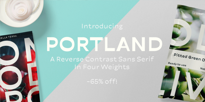 |
Made you look? There’s a peculiar feel to the letters – achieved by the reversed contrast. Perfectly legible yet there’s something about the characters that makes them stand out. As Viktor Shklovsky once coined, ”Habitualization devours objects” – the everyday world becomes invisible until we are forced to see it otherwise.
The Portland font family is a tool of choice when you want to effortlessly make your designs stand out.
 |
| Download Portland Fonts Family From Fenotype |
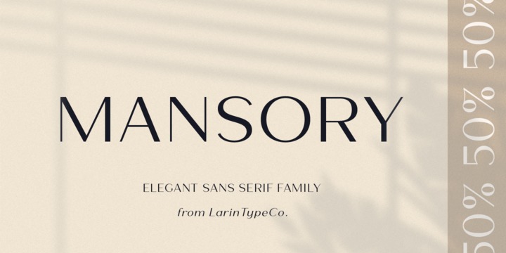
Mansory is a modern contrasting and elegant sans serif font, which is presented in an upright and oblique style and also has 4 weights, this gives more opportunities for your design project.
Contrasting lines and balanced forms of these fonts will provide recognition and will be easy to read. The regular style is perfect for text, while the heavier ones are perfect for logos, headings or will highlight exactly what you need.
Mansory has stylistic alternates and ligatures that are harmoniously combined with the font, with them you can make your project more individual. This font is easy to use and has OpenType features.
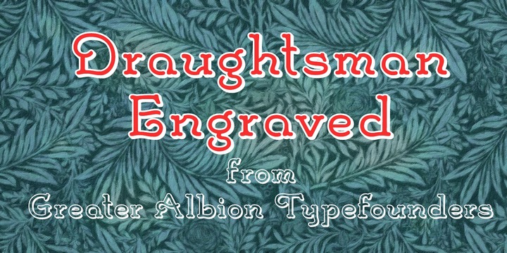
Draughtsman Engraved, inspired by hand drawn 19th century lettering, is an open shadowed display face, with an extensive range of OpenType features, including ligatures, stylistic alternates, petite and small capitals and old style numerals.
Draughtsman Engraved is ideal for headings, initial capitals and anywhere a touch of distinction is needed.
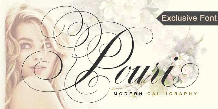 |
Pouri is a classic script with a modern style that is very suitable for wedding media, book covers, greeting cards, logos, branding, business cards and certificates, even for any design work that requires classics, formal or luxurious looks.
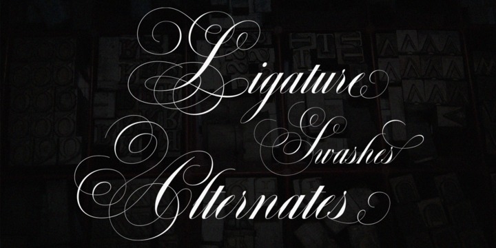
Pouri includes a wealth of OpenType features. If you don't have a program that supports OpenType features like Adobe Illustrator and CorelDraw X Version, you can access all alternative glyphs using Font Book (Mac) or Character Map (Windows).
 |
| Download Pouri Fonts Family From ejhaa |